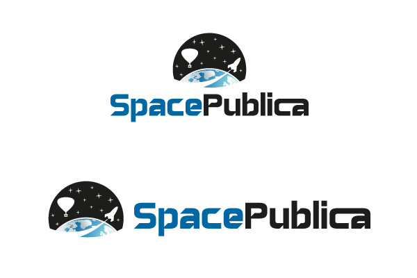
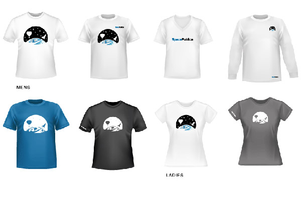
Space Publica
Space Publica got in touch with Wish Design Solutions to create a brand for the new business. This entrepreneur had the idea to make space travel available to everyone. The new identity is predominantly used on the web, in social media and travel apps. We created a versatile logo mark which combines the possibility of space exploration in pods and rockets. The logo mark is circular in form to reflect the shape of Earth. The logotype has a contemporary quality to represent the advances in space technology and innovative design, opening up space tourism to everyone in a safe environment. The typeface used is ‘space like’. The c and a are joined together to represents groups working together to bring space tourism to the public.
"I have worked with Hilda on numerous occasions since 1999. She is a very organised professional graphic designer. Every project we collaborated on came in on time and to brief. I love the crisp simple elegance of her work. I cannot recommend Hilda highly enough."
Turlough Rafferty