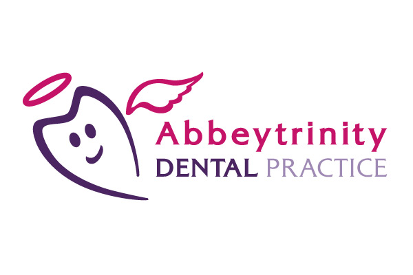
Abbeytrinity Dental Practice Brand
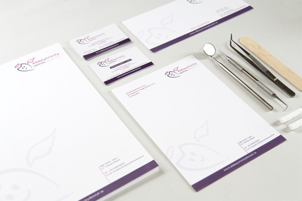
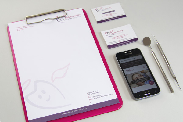
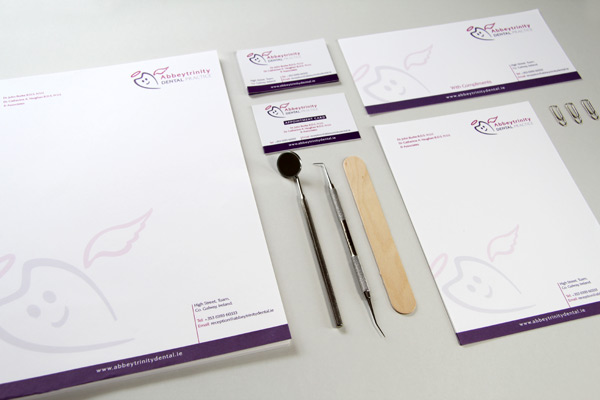
Abbeytrinity Dental Practice got in touch with Wish Design Solutions to redesign their logo identity and create a new stationery system. Most people dread going to the dentist. This fear stops them getting regular dental care. The Practice aspired to create a warm, caring, and gentle experience for the patients. Our initial sketch ideas were based on a confidence smile but it wasn’t conveying the Practice’s personality of being family friendly. With client input the focus moved to the idea of a healthy ‘good’ tooth. The typeface Alexon adds maturity, expertise, professionalism, and complements the flow of the friendly logo mark. Once the brand was agreed, it was developed across a suite of stationery, charts and pop-up stand. Brand identity guidelines were designed to guide the use of the core elements and to manage the brand expression across all media.
"The beautiful, strong and unique logo you have realised for us is more than we had ever hoped for. Your efficient professionalism showed at every step of the design process, from how carefully you listened to our brief, to the amazing level of precision in the finished artworks, support materials and printing advice. Your wonderful artistic creativity and energy has produced a logo that truly embodies and communicates our practice ethos of gentle, empathetic care and professional excellence. We are so happy, and will be thanking you for many years to come!"
Dr Catherine Vaughan and Dr John Burke, Abbeytrinity Dental Practice.